Archive for November, 2009

DeviantART

DeviantART is a worldwide American online communtity with worldwide appeal. It shows different forms of user-made artwork.

It was first made on the 7th of August 2000, the main makers being Scott Jarkoff (However, he is not part of the DeviantART staff anymore, as of  July 29th 2005), Matthew Stephens and Angelo Sotira. In the last 9 years DeviantART has had over 11 million members join, over 100 million submissions, and recieves around 100,000 submissions a day. Around 36 million people from all over the world visit the DeviantART website every year. DeviantART now has 7 versions. (The latest being released in September 2009).

DeviantART provides a place for any artist to exhibit and discuss work. The work is categorize into different sections, these include ‘Designs & Interfaces’, ‘Cartoons & Comics’, ‘Flash’, ‘Digital Art’ and ‘Photography’.  Everybody who is signed up to DeviantART has their own personal page, here they can show their own work and access artwork, information and journals.


I have chosen this picture because i like the way it has been manipulated. I think that the way it has been edited it has brought out the colours in the vegetation, it has gotten rid of the blues and drained colours and replaced them with more vibrant and attractive colours. They have done this using the hue/saturation. I like this photo because it looks more tropical and attracts the eye more. after looking at this photo i have gone and manipulated a photo in photoshop in a similar way, you can find this in my post ‘Abstract Experiments’.

The image above is a picture of a cat, i have chosen this picture to use on my blog because i like the way it has been edited. They have blurred the edges of the cat to make it seem to blend with the background, and also i think they would have de-saturated the photo to make it all completely black and white.

The image above is a picture of flowers. I like this photo because it is colourful and it attracts the eye. Only the flower in the foreground is in focus, the rest is blurred, this makes our eye only look at the flower that is in focus. I think that this photo is effective, however it would not be much use for me to blur the background in my ‘Awareness’ magazine because the background will be a photo itself.

This image is above, is very dull and dark, it does not attract my attention as much as a coloured photo would have, however it is still appealing because you look at the photo to see why it is so dull and uninviting. I like this photo because there is a plain background which makes the branches of the trees and bushes stand out more.

I have chosen this image above because it is colourful and the colours are over bright. The artist would have made the whole picture lighter. I like the way you can see the light hitting the glass that the objects are standing on. i think that the image attracts your eye because the colours are so vibrant.

I have choen this image to use on my blog as it has been edited in Photoshop, and also because i like the image. You can tell from the image even though it has been de-saturated that it was a sunny day when it was taken, this is because you can see on the hill in the distance that it is lighter one side and you can also see the rays of sunlight. I think that this looks effective, if you were to just glance at the photo you could see the rays as mist and that the picture has no colour because it was a rainy day. I also like that there is nothing else in the photo apart from one woman and her footsteps, this gives the effect that she is lonley. I have used the saturation in my photo manipulations, however i have used it in the opposite way, i changed the photo to unrealistic colours.

This image has also been manipulated, you can see this because most of the image is in black and white, except for three motorbikes. You can tell that the artist has done them in abstract colours becasue they are old bikes and they do not come in cthe colours in the photo. I think that this image looks effective because it attracts you attention and draws your eye to the colours. I think that these effects makes the image look alot more interesting.

Abstract Experiments

The image above is a picture of a tree trunk with ivy growing over it. I chose this photo because the tree is almost invisible and it shows a lot of texture.

This is the same image, however, i have edited it in Photoshop. I went into image, adjustments, and variations. There i changed the shadows to darker.I think this looks effective because it makes the ivy stand out more, and makes the background look a lot more darker and dull. This was what i was trying to achieve, as it emphasizes the plant which is nature. This will help me with my Awareness magazine.


The image above is a picture of a bush. I chose this because i had taken the picture quite close up, and i think you can see a lot of detail.

This is the same picture as above, however i have made the shadows darker, and highlighted the light parts of the leaf. I did this so that it made the leaves look like they have more depth. I think that the picture looks a lot more appealing than the original one.


The image above is a picture of a pile of leaves. I liked this photo because all of the leaves are different colours and i think it will look quite effective when i edit it.

This is the edited version of the picture above. To do this i went on images, adjustments, variations. I then changed the shadows darker and changed the whole picture a lot greener. I did this because i will be using these pictures in my Awareness magazine which is about economical factors, so green seems relevant. I have also turned it the right way around. I like the way that the leaves have turned different shades of green and yellow.


The image above is a picture of a tree trunk, i chose this image because i like the texture of the bark and i think it will be relevant later on in my project.

The image above, is the same picture however i have edited it. I firstly went into image, adjustments, variations and changed the shadows darker. I then change the mid tones to more green. After i did this i did not like the branches and the background also being green, so i used the lasso tool and selected everything around the tree trunk a changed it to solid black. I think this looks effective because it makes the tree trunk sand out. Also because i made the shadows darker, it has given the bark more texture. I made the trunk green because i think it looks unreal, and straight away you can understand the point i am trying to get across.


The image above, is of a stream with lots of leaves and soil either side of it.

This is the same image as above however, i have edited it to make it look more cartoon like. Firstly i used the lasso tool to select the stream and change it to a deep blue, to make it look unreal. I then used the magic wand to select all the soil and bits of rubble and turned the an unrealistic green. To make this look more like the original image i left the yellow leaves to make the grass have texture. Lastly, i went to filter, textures and selected grain and turned the whole picture to a different texture. I think this looks effective because the grass has now got the texture with the leaves and also with the special effects of the grain. However, i do not like the image manipulation because it looks childish. If i was to do it again, i would leave the stream as it was, so that it would just be the leaves, soil and rubble that were changed, this way you could tell that it has been manipulated and not drawn.


The image above is a picture of a tree trunk, i chose this picture because i think it looks attractive. I also think that i will be able to manipulate this well.

This is the same image as above, however i have edited it. To do this i have, gone to image, adjustments, variations. There i have changed the shadows a lot darker. I did this because it makes the bark of the trunk really dark, then i can emphasis the moss and leaves in the rest of the picture. To do this, i went to image, adjustments and hue/saturation. There i changed the saturation to over 70, and the lightness to over -20. I think that i have manipulated this photo effectively, the moss and the leaves stand out really well, which was what i wanted to achieve.

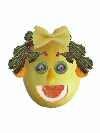
Photoshop melon face

photoshop melon face

I used pieces of fruit to create this face in photoshop. First i put the picture of the melon on to a new page and then selected the different items of fruit and out them on to the melon. To do the eyebrows i needed to flip the radishes. To do this i went on to edit, transform, flip horizontal. To do the hair i just duplicated the layer several times.

I used a grapefruit segment as the mouth, kiwi slices as the eyes with blueberries as the pupils, butternut squash as the nose, and the eyebrows and hair were made out of the radish. I used carrot as the ears and a pasta bow for a bow in the hair.

This is useful to my work because i am practicing Photoshop techniques, for my next project – The Awareness magazine cover.