This is a magazine called ‘Fashion’. The name of it straight away tells us what information is going to be included. The main focal point of the magazine is the model, however the name of the magazine if overlapping her. All of the text is pink, white and black which makes the whole magazine cover link together. The text is around the model it is also over lapping her clothes, however there is no text around her face. I think the target audience for this magazine would be teenage to young adult women.
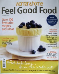
This ‘Feel Good Food’ magazine is part of the ‘Woman and Home’. It is quite a simple magazine cover, i think that this is good because it makes the food look healthy and clean. There is minimal text on the page, i think this is to emphasise the food in the middle of the page. The writing is reasonably small, and is quite hard colours, however they do not stand out too much. All of the colours in the background are soft and welcoming, they also make the food look enjoyable to eat. I think the target audience for this magazine would be adults of all ages, which are interested in cooking, both male and female.
This ‘NME’ magazine is about music. As you can see this magazine is layed out completley different to the two above magazines. The focal point in the magazine is the two celebs. The picture is the main attraction to the magazine, there is not much text and to save confusion the text has not been layed over the celebs, except for at the bottom, which is not a main part to the content of the magazine, and it does not really effect people buying it. People would most probably buy the magazine because of the celebs on the front cover. I think that the target audience for this magazine is teenagers to young adults, both male and female.
This ‘OK!’ magazine is about celebrities, and subjects which will encourage people to buy it. Katie Price is the main focal point of the magazine, you can see this because her head is covering the ‘OK!’ logo at the top of the page. The subheadings are the information which is included in the magazine. Most of the time these will be quotes, to attract the readers attention. For example “I found Pete in bed with another woman”, this quote is obviously going to grab the readers attention, this is wht is is in bold writing, and also i think this is why it has cut across Katie Price, it drags you eye to it. This magazine is also different to the others, this is because it has three other smaller pictures, with separate captions to go with them, showing that there is more than one story. These other pictures and captions are like well developed sub headings, giving us a hint of what we will be reading. I think the traget audience for this magazine, is teenage to adult women.
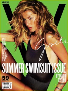
This magazine is called ‘V’ it does not have one specific topic that it covers, it has a variety. These are written on the magazine front cover, they are in the same place on each magazine. I like the cover of this magazine because it is so simple, however it attracts your eye because of the bright background colours, and the little amount of text. There is a large ‘V’ in the background which is the logo for the magazine. The model is once again the focal point of the magazine, however this is becasue there is not much else on the cover to look at. All of the text is in white, i think that this is because it stands out on all of the different colours they have in the cover, and also it is quite a hard and dominant colour. I think the target audience for this magazine is older teenagers and young adults.
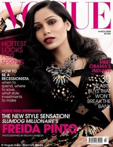
This magazine is called ‘VOGUE’. Once again the logo of the magazine is covered by the model. All of text is pink and white, these colours link with the clothes, jewelery and make-up of the model. I think that this gives the magazine a classy look about it. Text and pictures aren’t everywhere making it confusing for the reader, they are evenly spread out around the focal point being the model. I think the target audience for this magazine would be female adults.



Leave a comment